Oracle +
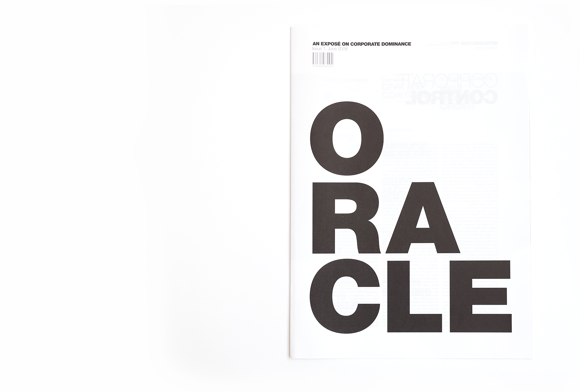
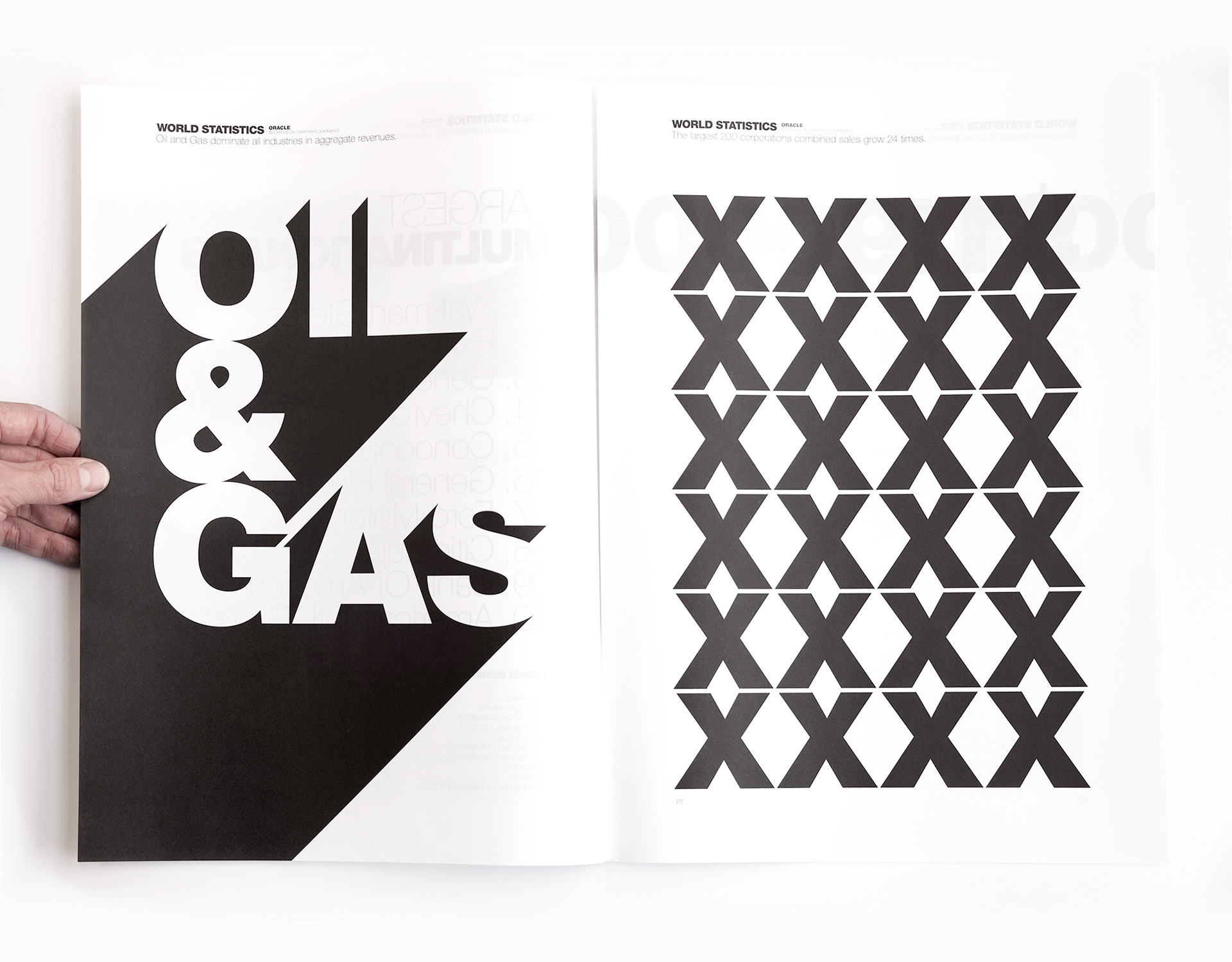
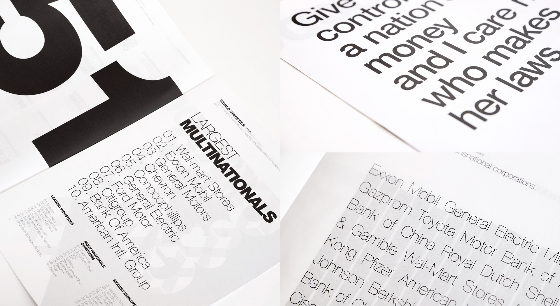
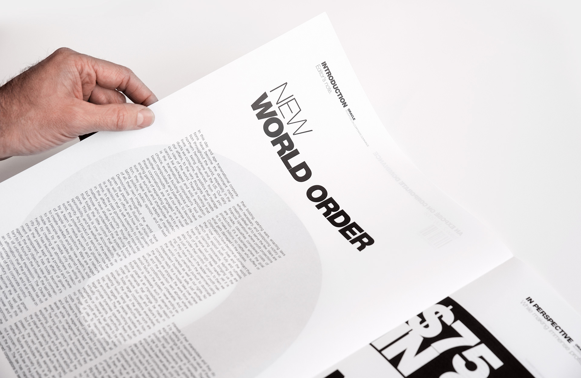
The rebel in us couldn’t resist this project, a quarterly newspaper with (info)graphics, which was an exposé on corporate control and its global dominance. First published in June 2008, a few months before the financial crisis, its purpose was to explore the impact of corporations and their role in steering the affairs of the world. Helvetica was chosen as font and we used the contrast between type and infographics to create a feeling that powerful, impersonal forces are at play. For this project we designed 4 editions, which were printed on quality, pure white, translucent paper. Time to rebel!
Identity, typography, editorial.


